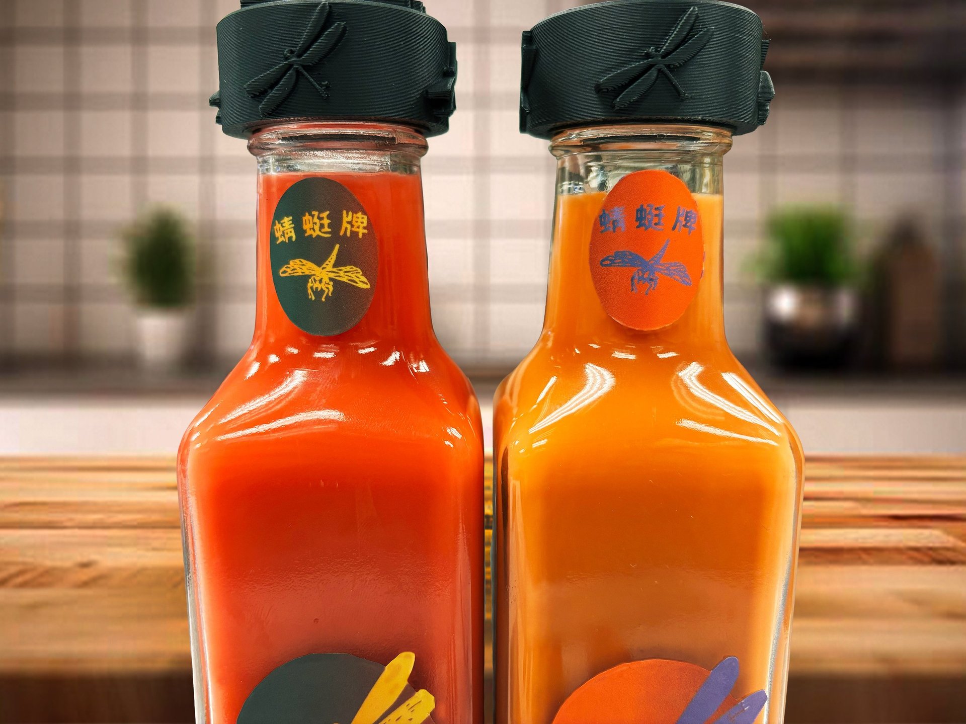
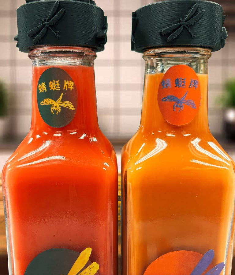
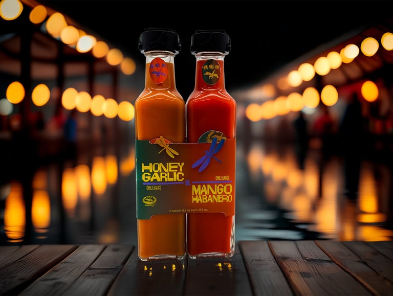
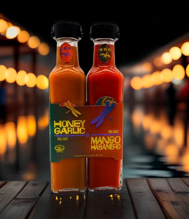
Pair is a packaging refresh project focused on revitalizing two flavors of a chili sauce. The project involved redesigning the bottles, creating a 3D-printed cap, and developing a belly band to unify the product’s identity. Through thoughtful typography, color, and structural design, I aimed to enhance shelf presence, highlight flavor distinction, and create a cohesive, modern look. The project combined brand analysis, packaging design, and 3D prototyping to produce a final result that feels intentional, visually engaging, and ready for retail.
PAIR
Packaging Project
Box completed
The process began with analyzing the existing brand and packaging to identify areas for improvement in hierarchy, readability, and visual appeal. I explored multiple design directions for the bottles, experimenting with typography, color palettes, and textures that would distinguish each flavor while maintaining cohesion. The 3D cap was prototyped and refined through iterative printing, balancing form and function. Finally, the belly band was designed to tie the elements together, providing both aesthetic appeal and practical branding. Every step of the process emphasized clarity, intentionality, and enhancing the overall consumer experience.
GIF of AI file, printed box, and box in real life
Illustrator File
Cutting process
Type Specimen
Details in box
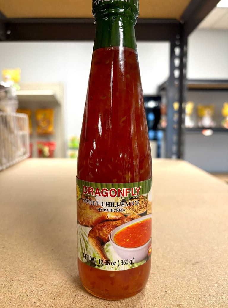
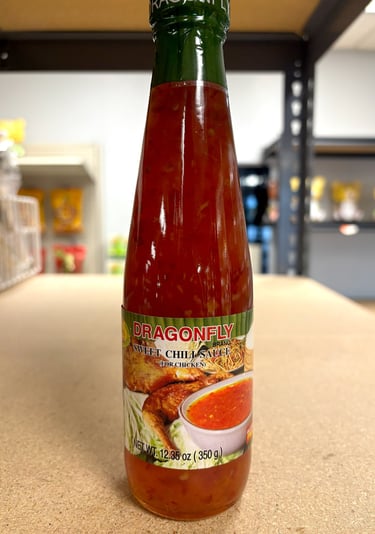
Photo of package
Photo of package